
What to Put in Your Website Footer
Learn what to put in a website footer so your site feels clear, trustworthy, and easy to navigate.
Your website ends.
And instead of guiding someone somewhere useful, it kind of… trails off.
You scroll down and notice it right away. The footer feels unfinished. Or busy. Or like it hasn’t been touched since you launched the site and immediately moved on with your life. Nothing is broken. But it doesn’t help either.
This is something I see constantly with service-based business websites. The main pages get attention, but the footer gets whatever energy is left. Which, honestly, is usually zero (I get itttt).
Here’s the thing. Your footer isn’t decoration. It’s not a backup plan. And it’s definitely not a place to dump everything you didn’t know where to put. It’s there to help guide your visitors, or the moment where someone decides what to do next.
Let’s talk about what actually belongs in a website footer, how to keep it simple (I honestly lost count of how many times I've said this 😂), and how to make it professional.
Why the footer matters more than it gets credit for
Most people don’t land on your site and immediately take action. They scroll. They skim. They read a bit. They pause. And when they reach the bottom, your footer quietly answers a few questions they probably haven’t even noticed they’re asking yet.
Is this a real business? Can I find what I need without digging? What happens next if I’m not ready right now?
A good footer supports the rest of your site by giving someone an easy way forward when they’re done reading but not done deciding. If the footer feels abrupt or confusing, that’s usually where people leave. If it feels clear, they’re much more likely to stick around.
The mistake most people make with footers
They treat them like storage.
If something doesn’t fit neatly on a page, it ends up in the footer. Extra links. Old offers. Social icons from platforms that haven’t been opened in years.
Or… A footer with almost nothing in it.
The goal isn’t minimalism for the sake of it. The goal is usefulness.
Your footer should quietly support the rest of the site, not compete with it, or explain everything again. Just help someone take the next step, or easily understand your site and business.
Mobile is also especially sneaky here. A footer that feels short on a big screen can feel exhausting on a phone. Always scroll your own site on mobile and see how it feels. If you get annoyed, your visitors definitely will.
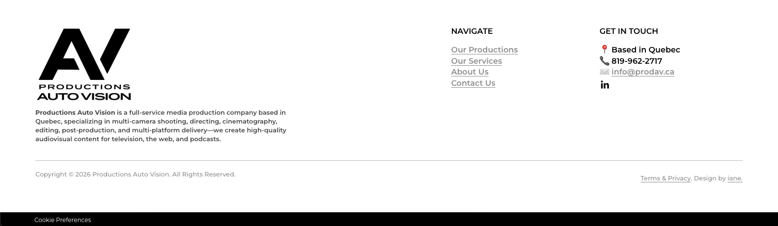
What to put in a website footer
Nothing is “one size fits all.” Your footer should feel intentional — a little like a curated mini-menu at the bottom of your site rather than a junk drawer. Think about your visitor: what do they need when they reach the very bottom of your page? Keep it focused, clear, and useful, and skip anything that’s just “because everyone else does it.”
Navigation
Navigation in your footer depends on your website size. If it’s a small site, I usually include all pages — because visitors might scroll down looking for anything. For the businesses I work with, this is often the case. If you have a bigger site, be intentional and only include the pages that matter most.
A typical footer navigation for service-based businesses might include:
Your main service or offer
About page
Contact or Book page
One helpful resource, like a blog or guide
Pro tip: Always link your homepage to the logo — it’s a small detail, but it drives usability AND my pet peeve radar goes off when it’s missing.
Brand information
Your footer should clearly remind visitors who they’re dealing with. This usually means including your logo and your brand name, ideally with a short tagline or USP for SEO purposes. For example:
Iane Market – done-for-you Squarespace websites for busy service-based businesses
It doesn’t need to be clever. Just clear. And yes, that little line can help Google understand what your site is about.
Contact information
Make it easy to reach you! After all, that's why we have a website. A contact page link and an email address are usually enough.
You don’t need a phone number unless you want phone calls. And as a millennial, I never want a phone call.
Social links you actually use
If you’re not active on a platform anymore, remove it. Dead links create doubt.
One or two active platforms is more than enough.
Legal basics
Copyright year + business name (and I'll set this to update automatically for you, so you never have to think about it again — and if you haven’t worked with me, check yours now! I bet it's not updated yet, hihi. No shame, just trying to help!).
Terms and Privacy Policy.
Cookie Preferences — especially important if you’re in Canada or somewhere else it's mandatory.
How to approach your footer without overthinking it
This is the rule I use every time.
Design your footer last.
Not because it’s unimportant, but because it needs context. You need to know what your site is asking people to do before you can support that decision at the bottom.
Once the rest of the site is clear, the footer usually becomes obvious.
Why this matters more than it seems
Your website is a system. Not just a collection of pages.
The footer is the safety net for people who aren’t ready yet. It’s where hesitation turns into curiosity instead of an exit.
When it’s clear, calm, and intentional, it builds trust without asking for attention.
And that’s usually what makes the difference.
If this made you rethink more than just your footer
If reading this made you realize your footer is one of several things you’ve been piecing together between real work and real life, you’re not behind. You’re just busy.
If you want a site that feels finished from top to bottom, you can explore my website design services or get in touch here and we’ll figure out the next step together.